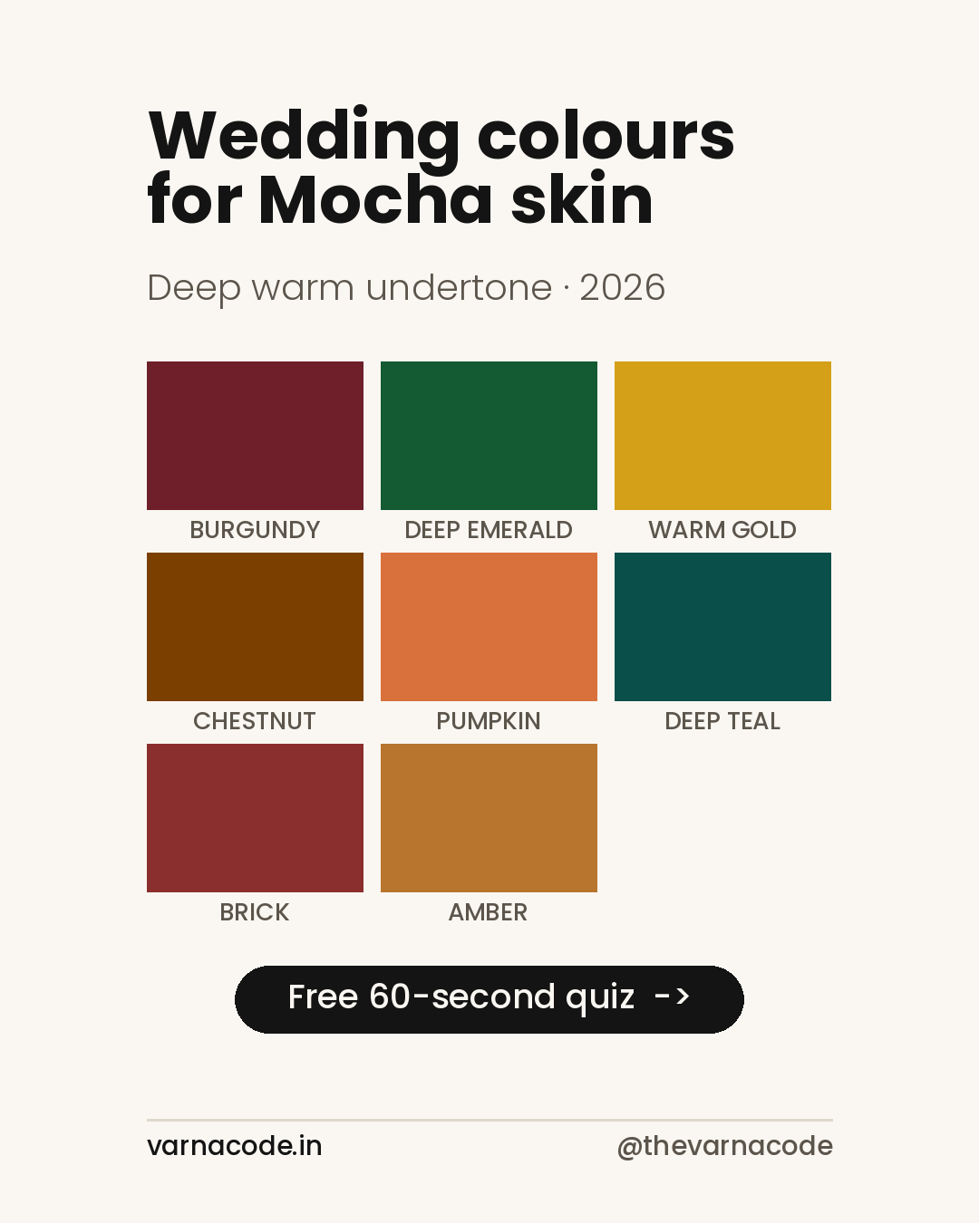
Wedding Guest Colours for Mocha Skin Tones (2026)
You’ve been invited to a wedding. You have three weeks, a budget, and a vague sense that some colours make you look well and others make you look tired. This is a guide to the second problem.
I’m not a stylist. I’m someone who is 31, lives in Jaipur, and found buying clothes genuinely hard until I started treating colour as a measurable thing rather than a matter of taste. What follows is that reasoning applied to wedding season.
First — are you actually mocha?
Most people arrive here unsure. Mocha sits in the deeper half of the eight tones we use, between caramel and espresso, and its defining feature isn’t darkness — it’s warmth. The undertone is deep warm: gold and red sit under the skin rather than blue or pink.
Two quick checks. In daylight, do the veins on your inner wrist read green rather than blue? Does gold jewellery look more natural on you than silver? Two yeses and you’re almost certainly in the warm family, and if you’re also deeper than a tan, mocha is the likely answer.
If you’d rather not guess, the 60-second quiz settles it, and it’s free.
Why deep warm skin behaves differently at weddings
Deep skin absorbs more light than it reflects. That single fact drives everything else: colours with high chroma — saturated, intense, undiluted — hold their shape against your skin instead of dissolving into it. Weak, chalky, washed-out colours are the ones that struggle.
This is why the standard advice to “avoid bright colours on dark skin” is backwards. Brightness isn’t the enemy. Muddiness is. A dusty sage and a deep emerald are both green; only one of them survives contact with mocha skin.
Evening reception — where mocha genuinely wins
Under warm indoor lighting, deep jewel tones do something on mocha skin that they don’t do on lighter skin: they read as rich rather than heavy.
- Rust
#A03E1E— the single most reliable reception colour for this tone. Deep enough to feel formal, warm enough to agree with your undertone. - Forest
#2D5A27— the contrast colour. Green sits opposite red-warmth on the wheel, which is exactly why it lifts. - Navy
#1B2A4A— quieter than forest, better if the couple’s palette is already loud, and the honest alternative to black.
Day functions — mehendi and haldi
Daylight is unforgiving in a different way. It flattens saturated darks, so the evening palette can look severe outdoors at eleven in the morning. Move warmer and lighter without moving pale.
- Gold
#C69B3C— the obvious mehendi choice, and for once the obvious choice is right. - Bronze
#A67B3C— softer than gold, less likely to compete with the decor. - Saffron
#E8820C— the one people don’t expect and then ask about.
Temple ceremonies and daytime rituals
These want restraint without dullness. Deep Olive #5A6435 and Terracotta #C4622D both do that — earthy, warm, quiet enough not to pull focus from the ceremony, deep enough not to wash out.
The colours to be careful with
Not banned. Careful.
- Sage green. The trend colour of the last few seasons and the hardest one for mocha skin. It’s low-chroma and slightly grey, so it reads as dust rather than colour. If it’s the couple’s chosen palette, take it in an accessory rather than a full outfit.
- Icy pastels. Not because they’re light — because they’re cool. A warm peach works where an icy lilac doesn’t.
- Mid-grey and beige. Nothing wrong with them; they simply do nothing for you. At a wedding that’s a wasted outfit.
For men
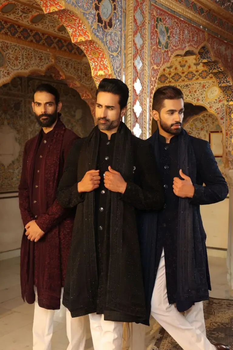
The same palette, different garments. A burgundy or deep teal kurta for the reception, warm gold or amber for daytime, chestnut for the understated end. The most common mistake I see is defaulting to black — it’s safe, it’s easy, and on deep warm skin it’s the least interesting thing available to you.
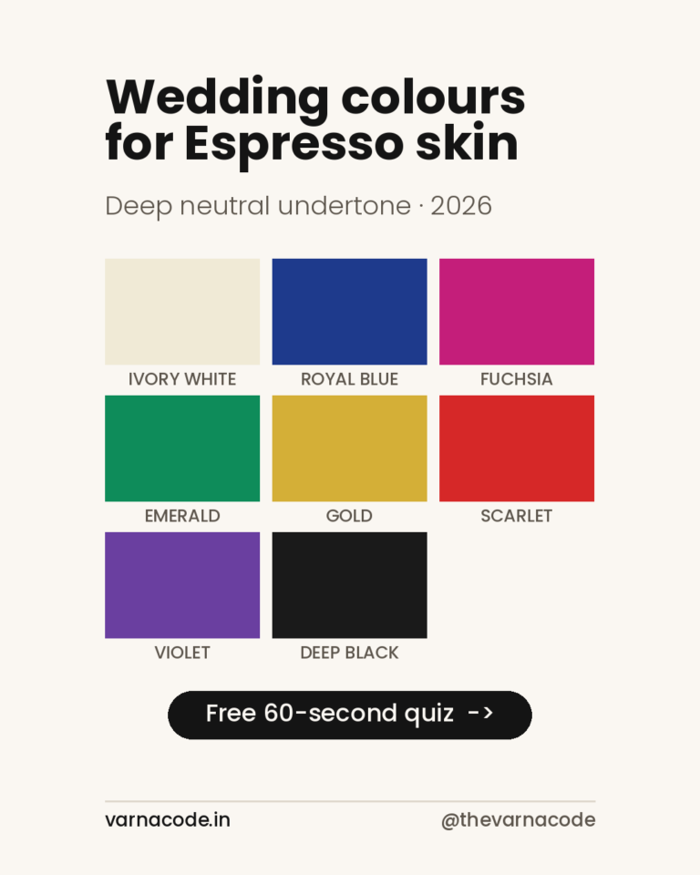
If you land closer to Espresso than Mocha, the undertone question changes with it — deeper skin is more often neutral than warm, which means Deep Winter rather than Deep Autumn. That split is worth reading before you shop, because the two seasons share no neutrals.
Where to go from here
Your full eight-colour palette with hex values, split by budget and occasion, is on the mocha wardrobe plan. If you’d rather see specific pieces, the picks page is filtered by tone.
And if you want the trend-first view of the season rather than the tone-first one, that’s in 2026’s trending wedding colours.
Deeper than mocha? The neighbouring tone is covered in wedding guest colours for espresso skin.
Varna Code
Not sure which tone is yours?
Takes 60 seconds. No selfie, no sign-up.
Take the free quiz →Launch price — first twenty
The Wardrobe Audit — ₹2,499
The quiz tells you your colours. This tells you what to do about them. You send photos of the clothes you actually wear — laid flat, in daylight, no people in the frame. I go through them against your palette and send back a written plan: what already works, what is quietly fighting your skin tone, what is missing, and a buy list ordered so the first thing you buy unlocks the most outfits.
Eight to twelve pages. Five working days. Your face is never involved — this site does not read people from photographs, and that does not change because you paid.
Opening to a small number of people first. Leave your email and I will write when a slot is free. No payment now, no obligation.
The quiz and your Wardrobe Plan stay free — always. This is the optional next step, not a paywall. Your email is only used to tell you when a slot opens.