The 7 Best Colours for Golden Skin Tones in 2026
Some links in this article are affiliate links. If you buy through them, Varna Code may earn a small commission at no extra cost to you. Every recommendation here is based on colour science — not on what pays.
Golden is one of the most common skin tones in India — warm, medium-depth, and genuinely lovely in almost any light.
Which is exactly why the advice you get is useless.
You’ve been told you can wear anything. That’s a compliment, not advice. Fair skin gets detailed guides. Very deep skin is starting to get them. Golden gets “you glow, anything suits you” — which sounds generous and leaves you standing in front of a rack with no more information than you had before.
Here are the seven colours that consistently work, the one that anchors them, and — more usefully — the specific way Golden skin goes wrong.
What is a Golden skin tone?
Warm undertone, medium depth. Your skin has golden or yellow warmth beneath the surface, tans readily and rarely burns badly.
Two quick checks in daylight:
- Jewellery test (most reliable) — gold makes your skin look brighter; silver looks slightly flat or cold against you
- Vein test (rough guide) — veins on your inner wrist read more green than blue
If both point warm and you sit in the middle of the depth range rather than light or deep, you’re Golden. If you’re warm but noticeably lighter, look at Honey; warm but deeper, look at Caramel or Mocha.
The mistake Golden skin actually makes
This is the part nobody writes, and it’s the reason “anything suits you” fails you.
Deep skin’s failure mode is muddiness — muted, dusty mid-tones that sit flat. Golden skin’s failure mode is completely different. It’s disappearing.
Nude, beige, camel, blush, oatmeal, soft taupe — these sit within a shade or two of your own depth. Put them next to your face and there’s almost no contrast. The garment doesn’t clash; it merges. You end up looking washed out in photographs and blaming the lighting.
It’s a quiet failure, which is why it goes unnoticed for years. Nothing looks wrong. It just doesn’t look like anything.
The fix isn’t avoiding neutrals. It’s making sure your neutral is meaningfully darker or lighter than you are — chocolate rather than camel, cream rather than beige.
There is a name for that gap. Chocolate over cream is what we call a Classic pairing — two colours far enough apart in depth that the outfit reads as deliberate. It is the pairing most people already own and have never named. See all four →
Your seven colours
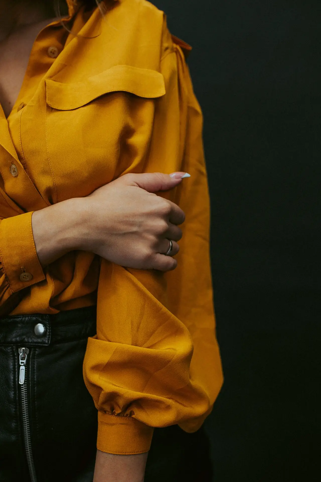
1. Mustard (#C8921A) — the closest thing you have to a signature. It mirrors your undertone without competing with it. Works as a shirt, a kurta, or a single accent piece. Shop Mustard Polo T-Shirt on Amazon
2. Terracotta (#C4622D) — high chroma, unmistakably warm, and the single strongest festive colour available to you. Also the dominant Indian bridal trend this year, which is convenient. Shop Terracotta Co-ord Set on Amazon
3. Rust (#A03E1E) — deeper and quieter than terracotta, and the better choice when the light is strong. An everyday red with brown beneath it, wearable in a way true scarlet is not for warm mid-depth skin.
4. Mossy Green (#6B7C4A) — green sits opposite red on the colour wheel, so against warm skin it creates lift without harshness. Also forgiving in Indian daylight, which is harsher than most colour advice assumes. Shop Mossy Green Linen Shirt on Amazon
5. Teal (#2A6B6B) — your best cool-leaning option. Deep enough to contrast, warm enough not to fight your undertone. Excellent in silk. Shop Teal Silk Saree on Amazon
6. Bronze (#A67B3C) — metallic warmth without the shine. The one that reads expensive in photographs and costs nothing extra to choose.
7. Navy (#1B2A4A) — this is your black. Deep enough for real contrast, and it does the job black is usually asked to do without the severity. If you default to black and it feels slightly hard, this is the swap. Shop Navy Formal Shirt on Amazon
The anchor: Chocolate (#4E342E) — not a hero colour, but the neutral that ties the other seven together. This is the one from the section above: meaningfully darker than you are, which is exactly why it works where camel does not. Use it for trousers and outerwear rather than next to your face.
Shop Rust Anarkali Kurta Set on Amazon
What to actually avoid
Not forbidden colours — specific traps:
- Nude, beige, blush and camel near your face. Too close to your own depth. This is the big one
- Icy pastels — baby blue, lavender, mint. Cool and pale against warm mid-depth skin reads slightly ill
- Pure cold grey — warm skin and cold grey are actively unflattering together. Warm greys and taupes are fine
- Optic white — cream, ivory and off-white are better on you. Bright white is a cool white and it fights your undertone
Day to night
- Office — chocolate, olive, warm teal, cream shirts. Skip the beige
- Everyday — mustard and olive do more work than anything else you own
- Festive and wedding — marigold, burnt orange, brick red. You have the easiest festive palette of any tone, because Indian occasion wear was built around warm colours. See 2026’s trending wedding colours for how this season’s palette maps across tones
- Summer — lean lighter within the warm family: marigold over mustard, olive over chocolate
Gold or silver?
Gold, comfortably. It echoes your undertone and warms your skin further. Rose gold and brass work too. Silver isn’t forbidden — but it needs a strong colour elsewhere in the outfit to carry it, rather than being the main event.
Common questions
Can I wear black?
Yes, but chocolate or deep olive will usually look better on you. Black is neutral-cool and slightly severe against warm mid-depth skin. If you love black, break it with a warm colour near your face.
Everyone says I suit everything. Is that true?
Broadly, yes — Golden is genuinely versatile. That’s precisely why it’s unhelpful. Versatile means the difference between “fine” and “excellent” is subtle, and subtle differences are the ones worth knowing.
What about pink?
Warm pinks — coral, salmon, terracotta-rose — work well. Cool blue-pinks and blush do not. Same colour family, opposite results.
I think I might be Honey or Caramel instead.
Likely if you’re noticeably lighter or deeper than mid-range. The palettes overlap considerably, so borderline tones can wear from both. More on why vague labels fail in why “wheatish” isn’t a colour.
Get your full plan
Take the free 60-second quiz → to confirm your tone, then get your Golden Wardrobe Plan → — all eight colours matched to your body type, occasion and budget, with real shopping links.
Golden has the deepest catalogue on the site. It takes about a minute.
Varna Code
Not sure if golden is your tone?
Takes 60 seconds. No selfie, no sign-up.
Take the free quiz →Launch price — first twenty
The Wardrobe Audit — ₹2,499
The quiz tells you your colours. This tells you what to do about them. You send photos of the clothes you actually wear — laid flat, in daylight, no people in the frame. I go through them against your palette and send back a written plan: what already works, what is quietly fighting your skin tone, what is missing, and a buy list ordered so the first thing you buy unlocks the most outfits.
Eight to twelve pages. Five working days. Your face is never involved — this site does not read people from photographs, and that does not change because you paid.
Opening to a small number of people first. Leave your email and I will write when a slot is free. No payment now, no obligation.
The quiz and your Wardrobe Plan stay free — always. This is the optional next step, not a paywall. Your email is only used to tell you when a slot opens.