Wedding Guest Colours for Espresso Skin Tones (2026)
There is a piece of advice that follows deep skin around: keep it dark, keep it neutral, don’t draw attention. It is wrong, and wedding season is where it costs you most.
I’m not a stylist. I’m 31, I live in Jaipur, and I found buying clothes genuinely hard until I started treating colour as something measurable rather than a matter of taste. This is that reasoning applied to being a wedding guest.
First — are you espresso or mocha?
These two get confused constantly, and the answer changes what suits you.
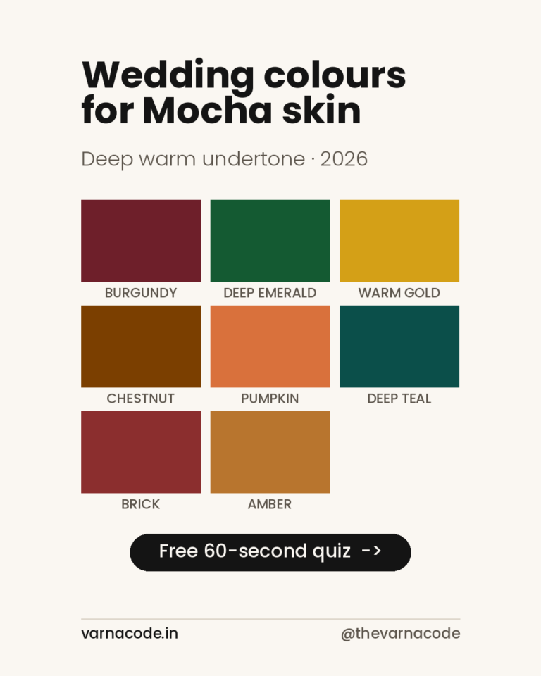
Mocha is deep with a clear warm undertone — gold and red sitting under the skin. Espresso is deeper still, and its undertone reads neutral rather than warm. That neutrality is the whole story: it’s why espresso can wear pure, saturated colour that would fight with a warmer tone.
A rough check: hold a piece of pure white paper next to your jaw in daylight. If your skin looks warm and golden against it, you’re likely mocha. If it looks neutral or slightly cool, espresso. If you’d rather not squint at paper, the 60-second quiz settles it.
The colour nobody expects: ivory
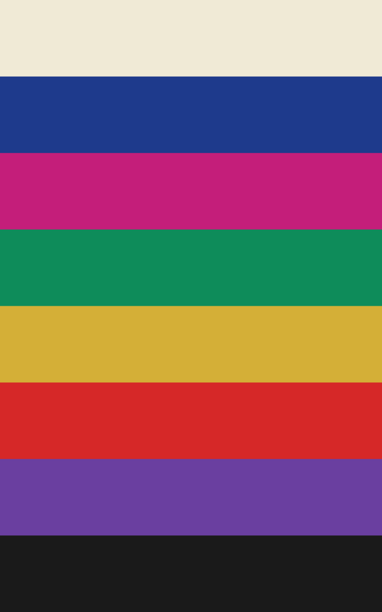
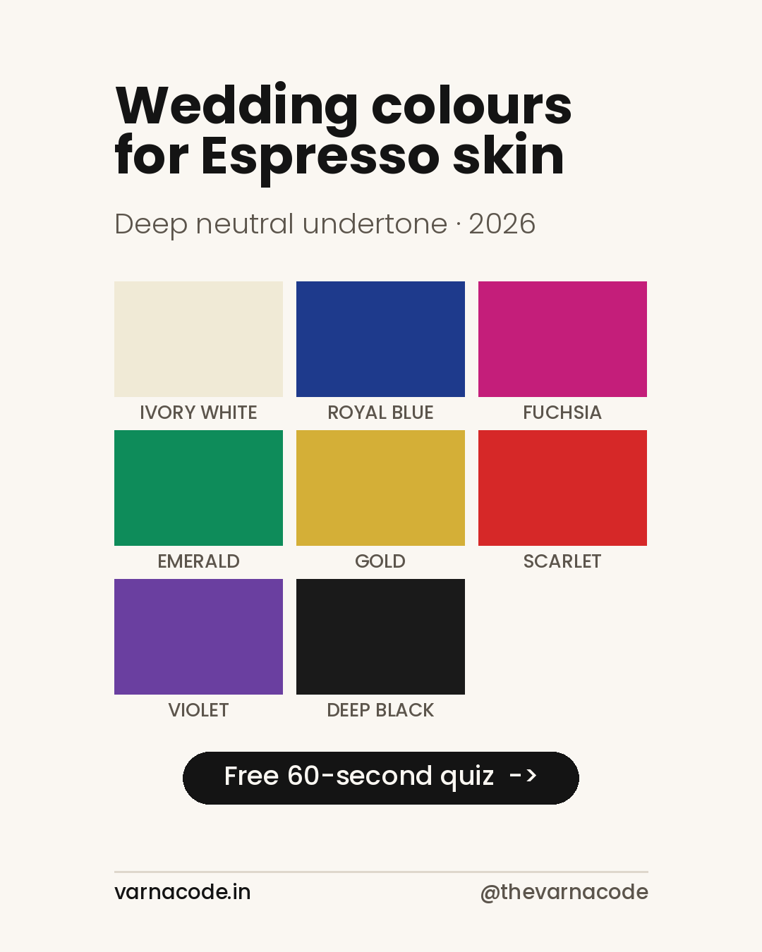
A true white #F7F7F5 is the single strongest thing you can wear, and it’s the one people are talked out of most often. It sits outside the eight because it’s your season’s neutral rather than a palette colour — the contrast is the entire effect.
The mechanism is contrast. Deep skin absorbs more light than it reflects; a very light, slightly warm off-white sits at the opposite end of that scale and the boundary between skin and fabric becomes crisp. Your features read sharper, not washed out. Pure stark white can be harsh — ivory has just enough warmth to avoid that.
For a daytime wedding function, an ivory kurta or an ivory-and-gold suit set is the most reliable thing you can wear. It is also, conveniently, one of the easiest colours to find in Indian ethnic wear.
Evening reception — go saturated
This is where espresso has an advantage that lighter skin genuinely does not. Highly saturated colours that overwhelm fair skin sit comfortably here, because there’s enough depth to hold them.
- Emerald
#1B6B45— the safest of the bold options and the one I’d start with. - Sapphire
#1F3C88— formal without being sombre. Works for men as sherwani or kurta. - Fuchsia
#C2185B— the one that proves the point. On most skin it shouts; on espresso it simply reads as colour. - Indigo
#3D3580— same logic, quieter. Underused at Indian weddings.
Ceremony and daytime — gold and scarlet
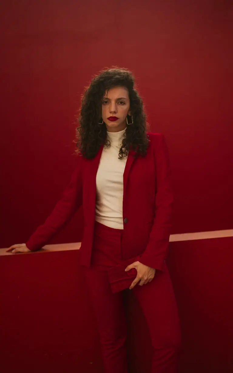
Gold #C69B3C is the obvious festive answer and it genuinely works here, particularly as a border or zari detail rather than a full outfit. True Red #C0182B is the traditional choice and holds up — a clean red with no brown in it, not a brick or rust, which drift warm and belong to mocha.
About black
Black #1A1A1A is your season’s neutral, not one of your eight. It’s the least interesting thing available to you.
Black is safe. It is also, on deep skin, low contrast — fabric and skin occupy a similar part of the light scale, so the outfit recedes. If black is most of what you own, that’s usually a decision made once out of caution and never revisited. At a wedding, where everyone else is in colour, it’s the one time it actively works against you.
What to be careful with
- Pastels that have been greyed down. Not pastels as a category — a clean peach or a clear lilac can work. The problem is dusty, muted versions, which read as faded next to deep skin.
- Beige, camel, taupe. Too close to the skin’s own value. Neither contrast nor harmony, just flat.
- Sage green. The trend colour of recent seasons and the hardest one here, for the same reason.
For men
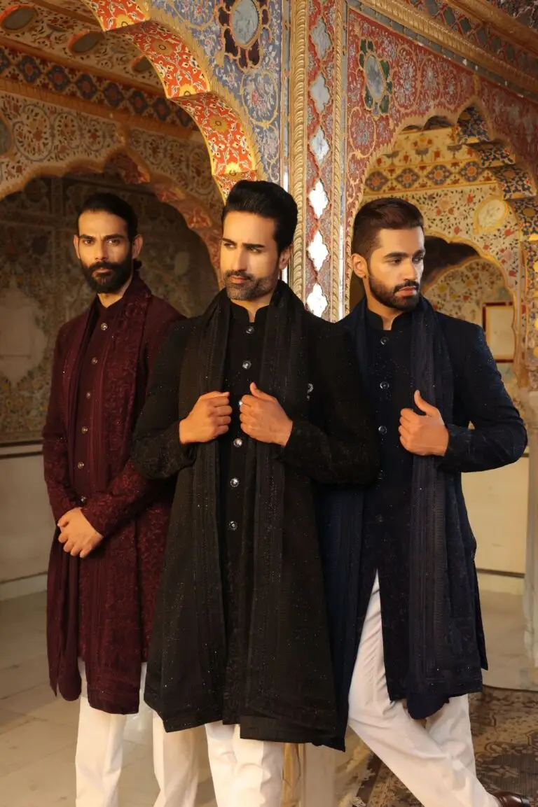
Identical palette, different garments. Ivory kurta for daytime, royal blue or emerald for the reception, gold detailing for the ceremony. The most common default I see is a black bandhgala — safe, and the least flattering option available to you.
Where to go from here
Your full eight-colour palette with hex values, split by budget and occasion, is on the espresso wardrobe plan. Specific pieces are on the picks page.
If you’re not certain you’re espresso rather than mocha, the mocha guide is the neighbouring tone. And the season’s trends, viewed trend-first rather than tone-first, are in 2026’s trending wedding colours.
Varna Code
Not sure which tone is yours?
Takes 60 seconds. No selfie, no sign-up.
Take the free quiz →Launch price — first twenty
The Wardrobe Audit — ₹2,499
The quiz tells you your colours. This tells you what to do about them. You send photos of the clothes you actually wear — laid flat, in daylight, no people in the frame. I go through them against your palette and send back a written plan: what already works, what is quietly fighting your skin tone, what is missing, and a buy list ordered so the first thing you buy unlocks the most outfits.
Eight to twelve pages. Five working days. Your face is never involved — this site does not read people from photographs, and that does not change because you paid.
Opening to a small number of people first. Leave your email and I will write when a slot is free. No payment now, no obligation.
The quiz and your Wardrobe Plan stay free — always. This is the optional next step, not a paywall. Your email is only used to tell you when a slot opens.