2026’s Trending Wedding Colours — And Which Ones Actually Work on Indian Skin
Every year the wedding trend forecasts land, and every year they are written as though everyone attending has the same skin.
2026’s palette is genuinely interesting, though — because the biggest trend in Indian weddings this year is brides choosing bridal orange over imported pastels. Burnt orange, tangerine, saffron. Deeply traditional, unapologetically warm.
That is not a fashion cycle. That is a colour correction.
Here is what is actually trending for 2026, and — the part nobody publishes — which of it works on which Indian skin, and what to do when it doesn’t.
What’s trending in 2026
Across bridal and guest wear, the year splits neatly in two:
- Day ceremonies — soft pastels. Sage green, blush pink, peach, icy and dusty blue, champagne, ivory
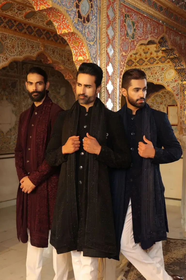
- Evening celebrations — jewel tones. Emerald, burgundy, royal blue, deep violet, gold
- The standout — bridal orange in all its forms, from saffron through burnt orange
Notice something about that split. The evening palette is made of saturated, high-chroma colours. The day palette is made of pale, low-chroma ones. That distinction matters enormously depending on your skin — and it is the single thing trend pieces never mention.
Bridal orange — the one that works for almost everyone
This is the good news. Orange in its deeper forms — saffron, burnt orange, rust, tangerine — is high chroma and warm, which makes it one of the most universally flattering families on Indian skin.
- Golden, Honey, Caramel, Mocha — outstanding. It mirrors your undertone directly
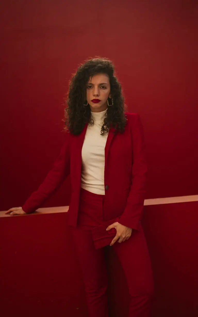
- Espresso — go for the saturated end. Saffron and true scarlet-orange, not muted terracotta
- Ivory — the only tone that needs care here. Cool undertones can find warm orange fights them. Shift toward a blue-based red or a deep coral instead
There is a reason this colour has survived every trend cycle in Indian weddings. It was never chosen for a mood board — it was chosen because it works.
Sage green — the problem child
Sage is the genuine breakout of 2026, and it is also the colour I would be most cautious about.
Sage is a muted mid-tone — greyed-down, mid-value, low chroma. On deeper skin it neither contrasts nor sings. It sits. That is the specific failure mode that makes people look tired in photographs and then blame the photographer.
If you’re Ivory or Golden, sage can be lovely — lighter, cooler skin has enough contrast against it to hold the colour up.
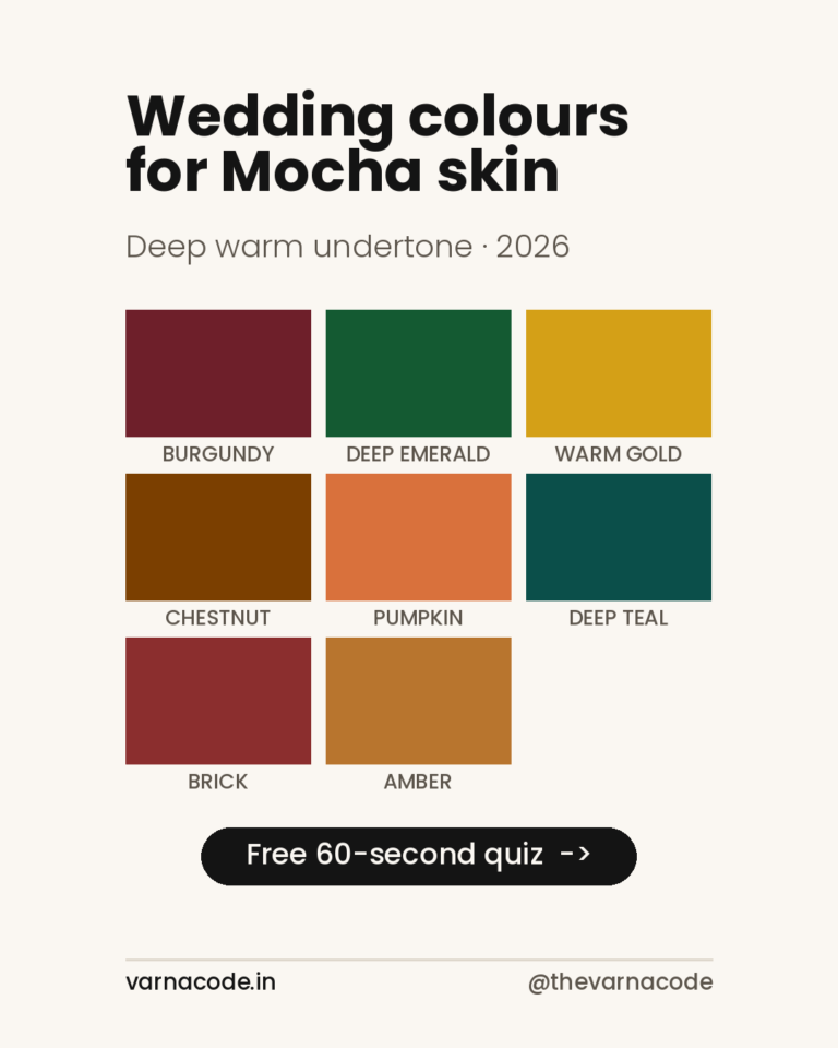
If you’re Caramel, Mocha or Espresso, don’t abandon green. Deepen it. Caramel’s palette already runs to Deep Olive and Forest Green; Mocha and Espresso carry Deep Emerald beautifully. Same colour family, same trend, vastly better result.
You are not opting out of the trend. You are taking the version of it with the chroma left in.
Icy blue versus dusty blue — not the same colour
Both are trending and they behave completely differently.
Icy blue is pale but clean — high value, reasonably pure. Against deep skin the contrast is enormous and the effect is striking. This is the same reason ivory and crisp white look so good on Espresso skin, and it’s why “avoid pastels” is such lazy advice.
Dusty blue is the same colour with grey mixed in. Muted mid-tone again. Same problem as sage.
The test is simple: does the colour look clear or does it look dusty? Clear works. Dusty doesn’t. That single question will serve you better than any seasonal chart.
Peach, blush and champagne
Warm pastels, and they follow the same rule.
Honey and Golden skin — peach is genuinely excellent. It sits right in the Honey palette alongside coral. Wear it happily.
Caramel, Mocha, Espresso — pale peach and blush tend to wash out. Push toward the saturated versions: coral instead of peach, fuchsia or deep rose instead of blush. You keep the warmth and the softness, you just take a version with some pigment in it.
Champagne and gold — universally strong. Gold appears in the Golden, Mocha and Espresso palettes for good reason. If you’re ever unsure at an Indian wedding, gold is the safest bet in the room.
Evening jewel tones — where deep skin wins
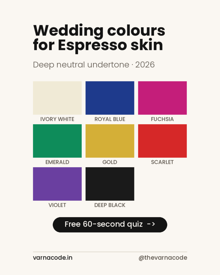
Put the Espresso palette next to the trending evening colours and they are almost the same list. Emerald, royal blue, violet, gold, scarlet.
That is not a coincidence. Jewel tones are high-chroma saturated colours, and deep skin carries saturation better than any other tone. The evening half of 2026’s palette was effectively designed for you.
So if you’ve spent years defaulting to black at weddings — this is the year to stop. Black is safe, black works, and black is also the one choice that guarantees you disappear in a room built entirely from colour.
A quick guide by tone
- Ivory — sage, icy blue, blush, champagne. Approach warm orange with care; use blue-based reds instead
- Golden — burnt orange, saffron, gold, peach, sage. One of the easiest years you’ll have
- Honey — peach, coral, gold, turquoise, saffron. Skip dusty blue
- Caramel — burnt orange, deep olive instead of sage, aubergine, forest green, bronze
- Mocha — burgundy, deep emerald, warm gold, rust. Skip sage and dusty blue entirely
- Espresso — emerald, royal blue, fuchsia, scarlet, gold, icy blue, ivory. The widest choice of any tone
Not sure which tone is yours? The skin tone chart puts all eight side by side with hex values — and if you would describe yourself as dusky, that word alone spans four of them.
The honest summary
2026’s palette isn’t good or bad for Indian skin. It’s two palettes wearing one label.
The evening half — jewel tones, orange, gold — suits medium and deep Indian skin superbly, and it suits it because those colours came from here in the first place.
The day half — sage, dusty blue, blush — was largely built around lighter, cooler skin photographing in soft northern daylight. It can absolutely work on deeper skin, but only in its clean, saturated versions, not its muted ones.
The trend forecasts won’t tell you which half is which. That’s the entire gap this site exists to fill.
Find your palette before the season starts
Wedding season runs October to December. Sale prices are best in the weeks before it begins, and worst once everyone is panicking.
Take the free 60-second quiz → to find your tone, then get your Wardrobe Plan → with eight colours matched to your skin, your body type and your budget.
It takes about a minute, and it will save you at least one outfit you’d have regretted.Going deeper by tone: wedding guest colours for mocha skin and for espresso skin — the first of eight tone-by-tone guides, written for guests rather than brides.
>Varna Code
Not sure which tone is yours?
Takes 60 seconds. No selfie, no sign-up.
Take the free quiz →Launch price — first twenty
The Wardrobe Audit — ₹2,499
The quiz tells you your colours. This tells you what to do about them. You send photos of the clothes you actually wear — laid flat, in daylight, no people in the frame. I go through them against your palette and send back a written plan: what already works, what is quietly fighting your skin tone, what is missing, and a buy list ordered so the first thing you buy unlocks the most outfits.
Eight to twelve pages. Five working days. Your face is never involved — this site does not read people from photographs, and that does not change because you paid.
Opening to a small number of people first. Leave your email and I will write when a slot is free. No payment now, no obligation.
The quiz and your Wardrobe Plan stay free — always. This is the optional next step, not a paywall. Your email is only used to tell you when a slot opens.