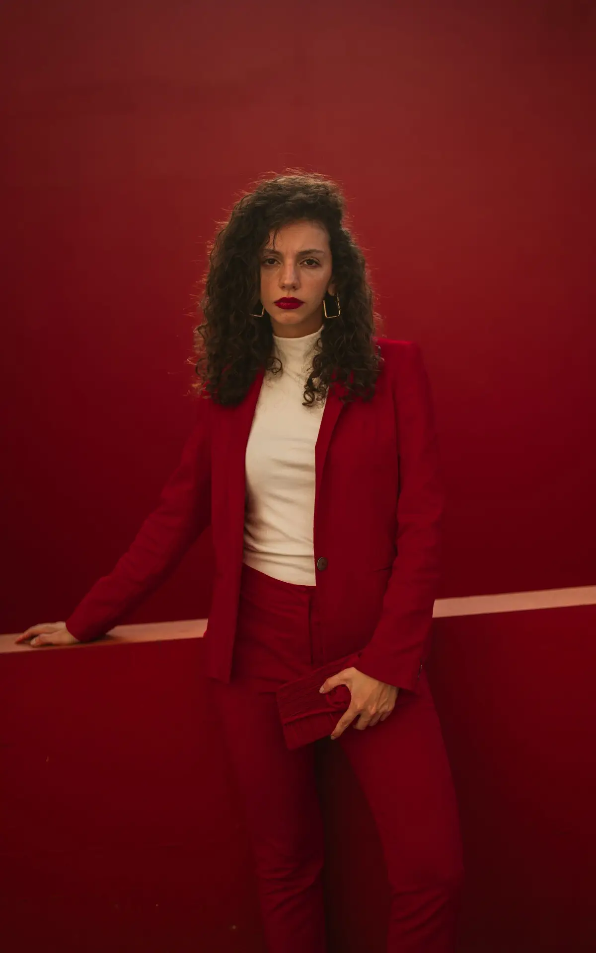
How to Wear 2026’s Boldest Colour Trends — Matched to Your Skin Tone
Some links in this article are affiliate links. If you buy through them, Varna Code may earn a small commission at no extra cost to you. Every recommendation here is based on colour science — not on what pays.
Fashion went loud again. After years of quiet luxury — muted neutrals, understated everything — 2026 is full of saturated reds, statement brights and colour that doesn’t apologise.
Which is lovely, unless you’re the sort of person who finds bold colour genuinely uncomfortable.
I’ll be honest about my own position here. For most of my life my wardrobe was black, grey, and one white shirt. Not because I’d decided that suited me, but because walking out of the house in something bright meant finding out in public whether I’d got it right. The barrier was never whether bold colour suited me. It was nerve.
So this is two guides in one: which bold colour is actually yours, and how to start wearing it without feeling like you’re in costume.
Why bold is back
Designers are calling it maximalism — dramatic colour, expressive silhouettes, pieces that feel personal rather than safe. For anyone who’s spent years being told to “stick to neutrals”, it’s a genuinely good shift.
But there’s a reason quiet luxury was comfortable: neutrals are forgiving and bold colours are not. A muted beige that’s slightly wrong for you just sits there. A saturated red that’s slightly wrong announces itself from across the room.
Which is exactly why “wear bold colours!” as advice is useless without the second half.
There is no universal bold
“Bold red” isn’t one colour. There are warm reds with orange underneath, cool reds leaning blue, deep brick reds with brown in them. They behave completely differently against different skin.
Your bold is the saturated version of a colour already in your palette. Not a colour from somewhere else.
- Ivory (cool) — Raspberry (#B3446C), Teal (#2A6B6B), Navy (#1B2A4A). Clean and cool. Your bold is saturation, not warmth.
- Honey (warm, lighter) — Coral (#E07A5F), Turquoise (#30A5A5), Golden Yellow (#E8B33C). Bright rather than deep — depth is what swamps you.
- Golden (warm) — Mustard (#C8921A), Terracotta (#C4622D), Rust (#A03E1E). The traditional festive palette is already yours.
- Amber (warm, mid) — Terracotta (#C4622D), Rust (#A03E1E), Olive (#7D8C3C). Same family as Golden, carried a shade deeper.
- Caramel (warm-olive) — Spice Orange (#D2691E), Aubergine (#4A2545), Forest (#2D5A27). Unusual rather than loud, which is the better kind of bold.
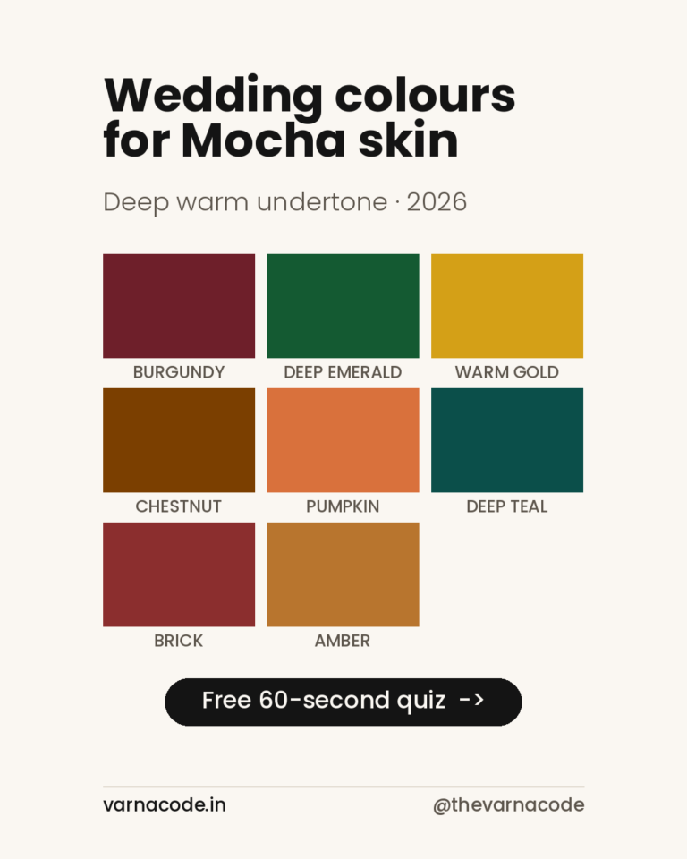
- Mocha (deep warm) — Saffron (#E8820C), Forest (#2D5A27), Rust (#A03E1E). High chroma in the warm family; muddy is the only real enemy.
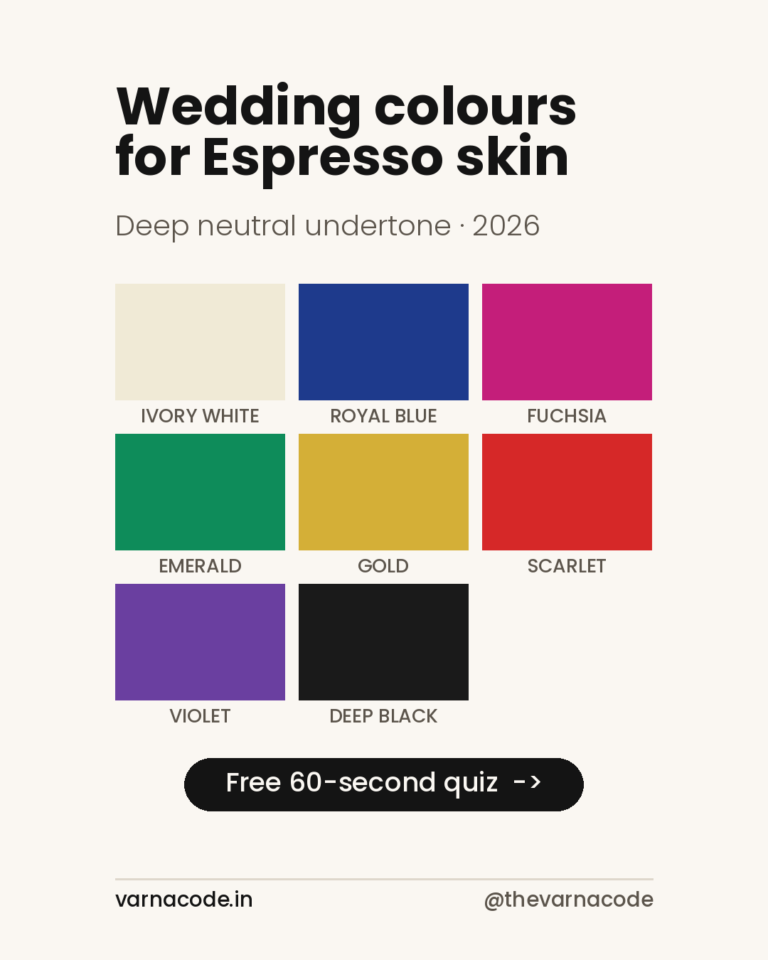
- Espresso (deep) — Fuchsia (#C2185B), Sapphire (#1F3C88), True Red (#C0182B). Pure saturated colour, and almost nothing is too much.
- Cacao (deepest) — Fuchsia (#C2185B), Marigold (#E8A013), Amethyst (#6C4AB0). The widest licence on the chart. Use it.
Common questions
I’ve been told bright colours don’t suit me. Is that true?
Almost certainly not. What’s usually true is that a particular bright — someone else’s bright — didn’t suit you. There’s a saturated colour in every palette, including yours.
Isn’t maximalism just a trend that’ll pass?
Yes. But your palette won’t. Buy the bold colour that’s actually yours and it outlives the trend that introduced you to it.
What if I genuinely prefer neutrals?
Then wear neutrals — but wear your neutrals rather than the default black-white-grey, and put one colour near your face. That’s usually enough.
Does bold work if I’m older?
Yes. Saturated colour tends to read as confident at any age. Washed-out muted tones are the ones that age a look, not bright ones.
Find your bold
Take the free quiz to find your tone, then browse picks for your tone — your eight colours, including the saturated ones, with real shopping links.
Start with one piece. That’s genuinely all it takes.
Varna Code
Which of these are your colours?
Takes 60 seconds. No selfie, no sign-up.
Take the free quiz →Launch price — first twenty
The Wardrobe Audit — ₹2,499
The quiz tells you your colours. This tells you what to do about them. You send photos of the clothes you actually wear — laid flat, in daylight, no people in the frame. I go through them against your palette and send back a written plan: what already works, what is quietly fighting your skin tone, what is missing, and a buy list ordered so the first thing you buy unlocks the most outfits.
Eight to twelve pages. Five working days. Your face is never involved — this site does not read people from photographs, and that does not change because you paid.
Opening to a small number of people first. Leave your email and I will write when a slot is free. No payment now, no obligation.
The quiz and your Wardrobe Plan stay free — always. This is the optional next step, not a paywall. Your email is only used to tell you when a slot opens.