Is Your Skin Mocha or Espresso? How to Tell — and What to Wear
Some links in this article are affiliate links. If you buy through them, Varna Code may earn a small commission at no extra cost to you. Every recommendation here is based on colour science — not on what pays.
If you have deep skin, you already know the frustration. Colour guides stop at “dusky”. Foundation ranges run out before they reach you. And the advice that does exist is mostly a list of things to avoid.
I write this as someone who is Espresso for half the year. I read Caramel through winter and tan two bands deeper by the end of summer — which took me a long time to understand, and explains why advice that worked in January stopped working by May. For years I assumed the problem was me — that I was simply bad at clothes. It took me an embarrassingly long time to work out that the advice was never written for my skin in the first place.
Deep skin can carry the most dramatic colours in the entire spectrum. Here is the guide I wish I’d had.
First — which one are you?
Mocha and Espresso sit at the rich end of the tone spectrum, and the difference between them matters more than most people think.
MOCHA — Deep warm brown (Fitzpatrick Type V, Monk Skin Tone 7). Your skin carries visible warmth — golden or red undertones — and tans deeply without burning.
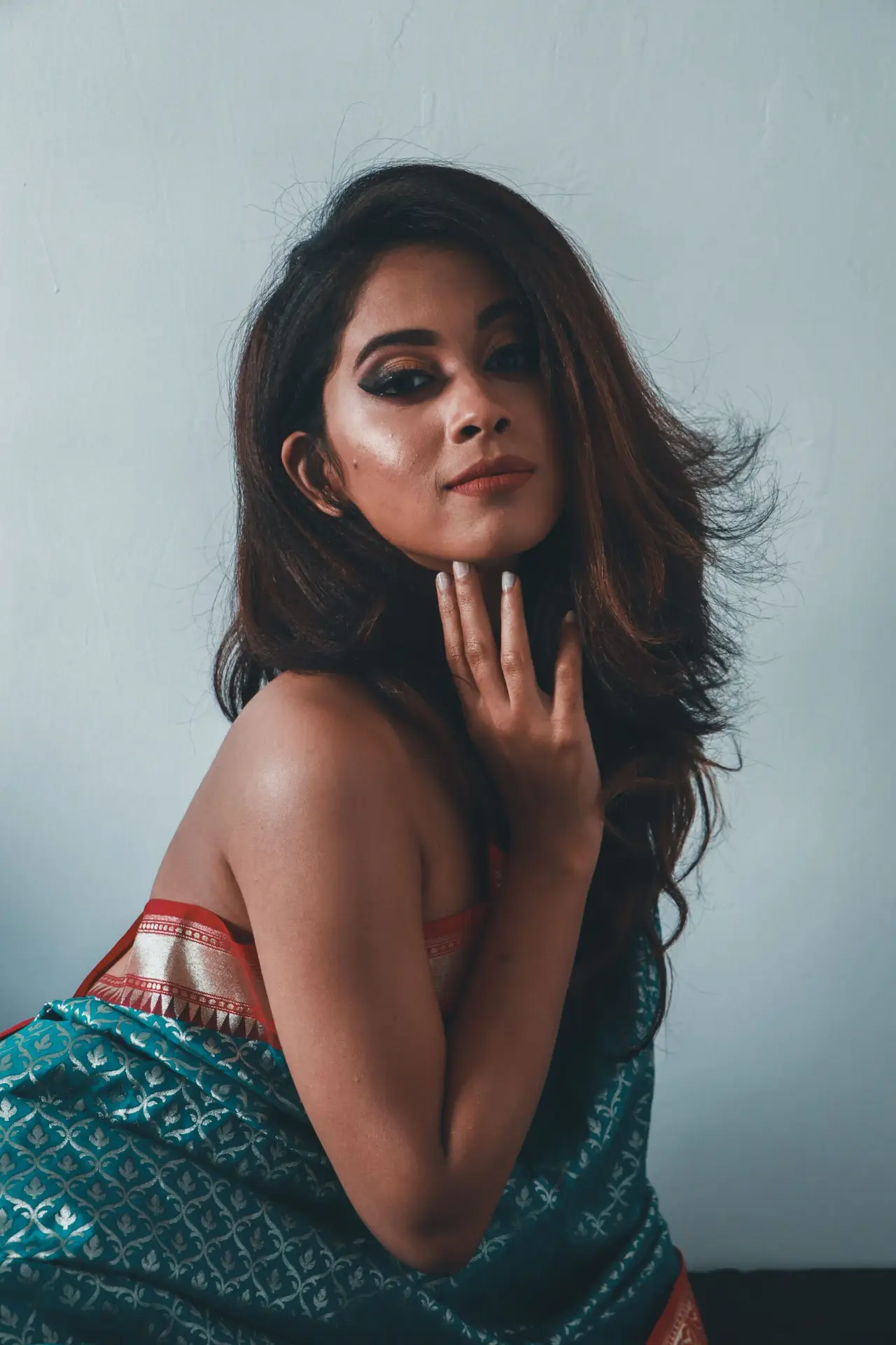
ESPRESSO — The deepest, richest brown (Fitzpatrick Type V–VI, Monk Skin Tone 8). Your skin holds extraordinary depth, and high-contrast colours look remarkable against it.
One honest note about those scales. The Fitzpatrick scale was created in 1975 by dermatologist Thomas Fitzpatrick to predict how skin responds to UV light — essentially, how easily it burns. It was designed around skin cancer risk in lighter-skinned people, and in its original form it did not include darker skin at all. Types V and VI were added afterwards. It still gives four categories to light skin and only two to every shade of brown and black.
The Monk Skin Tone Scale, developed by Ellis Monk with Google and released in 2023, was built to fix exactly that. It has ten shades, six of which cover medium and deep skin.
Neither scale tells you what to wear. They describe where you sit, not what suits you. But it is worth knowing that the standard tool for classifying skin was not originally built for yours — which is a reasonable summary of the whole problem.
Not sure which one is you? Take the free 60-second quiz →
Why deep skin works differently — the part nobody explains
Most colour advice descends from the Western “seasonal” system, built around fair, Caucasian skin, or from the Korean personal-colour system, calibrated for East Asian skin. Both are good systems. Neither was designed around melanin-rich skin.
Here is what actually changes.
Deep skin absorbs more light than it reflects. That single fact drives everything else. A colour sitting next to your skin is not competing with a bright, reflective surface — it sits against depth. So saturated colours do not overwhelm you the way they overwhelm fair skin. They have room to sing.
Chroma matters more than lightness. Chroma is how pure or intense a colour is — how far it sits from grey. On deep skin, high chroma reads as vivid and deliberate. Low chroma reads as dusty, and dust is what makes people look tired.
This is why “avoid pastels” is bad advice. It gets repeated constantly and it is wrong. A clean, bright ivory looks superb against Espresso skin — the contrast is enormous and the colour is clean. What actually fails is the muted mid-tone: sage, dusty rose, greige, muddy lavender. Not light enough to contrast, not pure enough to sing. They just sit there.
Clean and bright works. Deep and saturated works. Muddy is the enemy — not lightness.
The colours that work for Mocha
The colours that work for Mocha
Mocha’s defining feature is visible warmth, so the palette leans into the warm family and lets it harmonise rather than fight.
- Gold (#C69B3C) — mirrors your undertone directly, and not only as jewellery. A gold kurta on mocha skin is the entire outfit
- Saffron (#E8820C) — high chroma, warm family — the loudest colour you can wear comfortably, and it was made for festive light
- Rust (#A03E1E) — deep red-orange with earth beneath it; richness without harshness
- Terracotta (#C4622D) — the everyday version of saffron. Warm, grounded, and it does not shout
- Forest (#2D5A27) — green sits opposite red on the colour wheel, so against warm skin it makes you look luminous
- Deep Olive (#5A6435) — tonal with your own depth, so it reads considered rather than contrasting
- Navy (#1B2A4A) — your cool-leaning option and the honest alternative to black — deep enough to contrast, never severe
- Bronze (#A67B3C) — autumn-adjacent, superb in natural light, and the one people cannot quite name
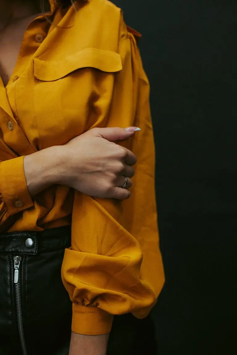
GOLD is not just for jewellery. Gold fabric, mustard-gold, honey shades — they mirror your undertone and create instant radiance. Shop Mustard Polo T-Shirt on Amazon
DEEP RUST is earthy and rich, and sits beautifully against mocha skin without ever washing you out. Shop Brown Floral Printed Kurta on Myntra
FOREST GREEN grounds your warmth and photographs beautifully every time. Shop Mossy Green Linen Shirt on Amazon
The colours that work for Espresso
Espresso reads closer to neutral-deep than warm, which means it can take pure, saturated hues that would overwhelm almost anyone else. This is the widest palette on the entire spectrum.
- Emerald (#1B6B45) — jewel green, festive-ready, and the single most reliable colour on this list
- Sapphire (#1F3C88) — pure, saturated, unmistakable. The blue that most skin cannot hold and yours can
- True Red (#C0182B) — clean red with no brown in it — the version of red that deep skin owns outright
- Fuchsia (#C2185B) — a high-chroma pink most people are told to avoid. Yours is the skin it was written for
- Indigo (#3D3580) — rich, unexpected, and almost nobody wears it. Which is precisely the point
- Burgundy (#7C1D2E) — the reception colour. Deep enough to read as considered, saturated enough not to sink
- Gold (#C69B3C) — metallic warmth against depth — the reason gold jewellery looks so good here
- Saffron (#E8820C) — the daytime counterweight to all that jewel tone. Warm, bright, and it holds
About white. A clean, bright white is among the strongest things you can wear, and it is not in the list above because it is a neutral rather than a colour — the contrast is the entire effect. About black. Black is safe on Espresso skin and it genuinely works. But if black is eighty per cent of your wardrobe, you are not choosing it — you are hiding in it. I did this for years. One ivory shirt will do more for how you look than ten more black tees.
One caution on the deepest tones. Espresso and Cacao are more often neutral than warm, which puts them in Deep Winter rather than Deep Autumn — and those two seasons share no neutrals at all. Why deep skin is so often Deep Winter covers that split, and what it changes.
What to actually avoid
Not a list of forbidden colours. A list of finishes and tones that consistently underperform:
- Muted mid-tones — sage, dusty rose, greige, muddy mauve. Neither bright nor deep
- Washed-out beige and camel close to your own depth — tonal dressing works when it is deliberate and fails when it is accidental
- Heavily faded or stonewashed fabric — the fade strips out exactly the chroma you need
- Shiny synthetic finishes in mid-tones — sheen plus dullness reads cheap. Matte in a rich colour always looks more expensive than shine in a dull one
Deliberate tonal dressing has a name. We call it a Suave pairing — two colours close enough in depth that the outfit reads as one considered thing rather than two. Accidental tonal dressing is the same move without the intent, which is why one looks expensive and the other looks like you dressed in the dark. The four pairings, and which are yours →
Putting it together by occasion
Office. Ivory or white shirt, charcoal or deep navy trousers. Add burgundy or deep teal when you want the outfit noticed. Shop Navy Formal Shirt on Amazon
Festive and wedding. This is where deep skin has a genuine advantage. Emerald, burgundy, royal blue and gold are exactly the palette Indian occasion wear is built around, and they were made for this depth. Do not default to black at weddings — it is the one time the room is full of colour and you can win. Shop Green Gold-Print Kurta Set on Amazon
Everyday. Two or three high-chroma t-shirts in your palette will change more than any single expensive purchase. Start there, and pair them with a clean dark denim. Shop Men Bootcut Stretchable Jeans on Myntra
And if you want one piece that does the work of an outfit: Shop Burgundy Wrap Dress on Amazon
Common questions
Can I wear white?
Yes — and you should. Clean white and ivory are among the strongest colours available to deep skin. The contrast is the point.
Does gold or silver jewellery suit me better?
Gold, generally, for Mocha — it echoes your undertone. Espresso can carry both, and silver against very deep skin can look striking and modern.
What if I am between Mocha and Espresso?
Wear from both palettes. They overlap more than they differ. The quiz will place you, but the honest answer is that borderline tones get two palettes rather than one.
Do I really have to avoid pastels?
No. Avoid muddy. A clean pastel is fine; a dusty one is not.
Ready to see your full palette?
Get your free Wardrobe Plan for Mocha →
Get your free Wardrobe Plan for Espresso →
Eight colours matched to your body type and budget, with real shopping links. It takes about a minute.
Varna Code
Mocha or espresso — which are you?
Takes 60 seconds. No selfie, no sign-up.
Take the free quiz →Compare your jawline against both tones in natural daylight, not indoor lighting. Mocha is a deep warm brown that still shows visible warmth; espresso is noticeably deeper and richer. If you’re between the two, check how gold jewellery sits against your skin — mocha usually carries more visible glow.
Espresso skin carries the most saturated colours in the spectrum without being overwhelmed — emerald, indigo, gold, saffron and burgundy all read exceptionally well. The colours to genuinely avoid are dark browns and muddy tones that sit too close to your own depth, which flattens contrast rather than creating it.
No — this is one of the most repeated pieces of bad advice in Indian fashion. What fails on deep skin isn’t lightness, it’s low chroma: a washed-out, greyed pastel disappears, but a clear, saturated light colour holds its own beautifully. Judge a colour by its intensity, not its lightness.
Deep skin creates high natural contrast, so colours need enough saturation to hold their own against it. A muted shade gets absorbed into the overall depth of the look, while the same hue at full intensity stays distinct and defined.
Launch price — first twenty
The Wardrobe Audit — ₹2,499
The quiz tells you your colours. This tells you what to do about them. You send photos of the clothes you actually wear — laid flat, in daylight, no people in the frame. I go through them against your palette and send back a written plan: what already works, what is quietly fighting your skin tone, what is missing, and a buy list ordered so the first thing you buy unlocks the most outfits.
Eight to twelve pages. Five working days. Your face is never involved — this site does not read people from photographs, and that does not change because you paid.
Opening to a small number of people first. Leave your email and I will write when a slot is free. No payment now, no obligation.
The quiz and your Wardrobe Plan stay free — always. This is the optional next step, not a paywall. Your email is only used to tell you when a slot opens.